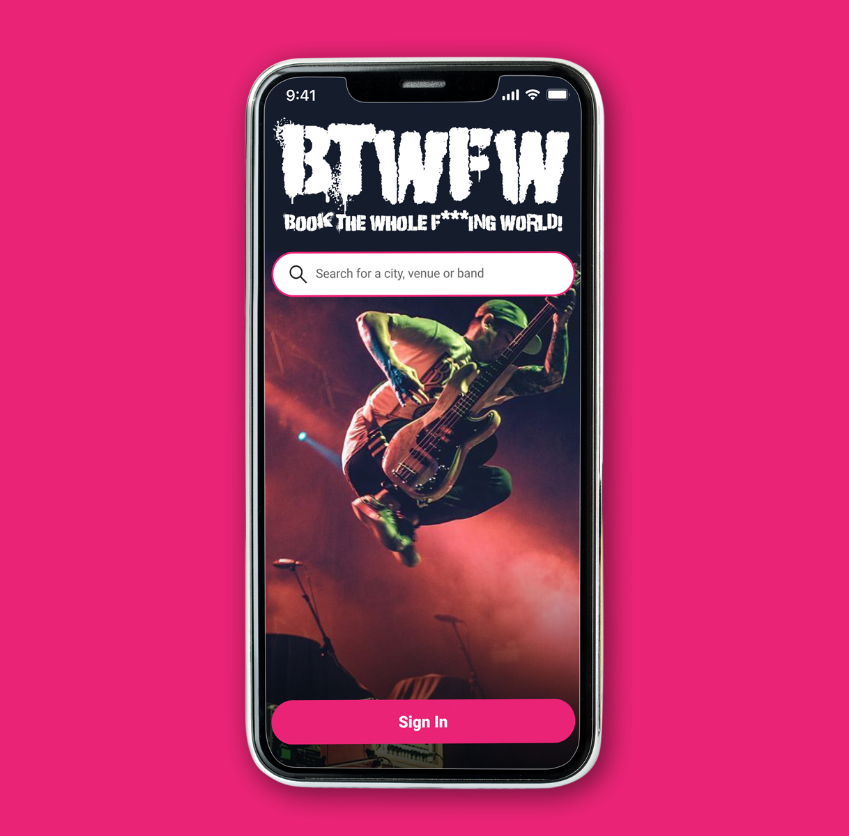
BTWFW App Design
OVERVIEW
There are currently no resources that lend themselves specifically to the “Do It Yourself” live music concert promoter. Moreover, given that the independent music scene is based on the DIY mindset, bands are often required to seek our their own performance spaces and book their own shows each and every time they perform. The BTWFW application was conceived and designed to aid both the promoter and the indie band by helping them solve this recurring issue.
ROLE
UX/UI Designer
UX Design & Research, UI Design
Status:
In Development
Background
Throughout the 1990s and early 2000s, a Punk and alternative magazine (or zine) called MaximumRockAndRoll released an annual special edition called BYOFL. This was a zine that was wholly dedicated to helping smaller bands (without booking agents) book their own shows and tours. Without it, most of the bands at the time wouldn't have had the knowledge to make their music heard across the country. Mind you, this was at a time before Spotify and Social Media. Try booking a show in rural Texas under those circumstances, I dare you!
The Story of the DIY Publication That Kept Bands on the Road for Decades:
"How 'Book Your Own Fuckin' Life' helped countless punk bands tour in the pre-internet era."
-Vice.com
To my surprise, the methods of booking events have not really changed in 20 years. The only difference is that artist will contact each other using social media rather than the telephone.

Discovery:
Research & Analysis
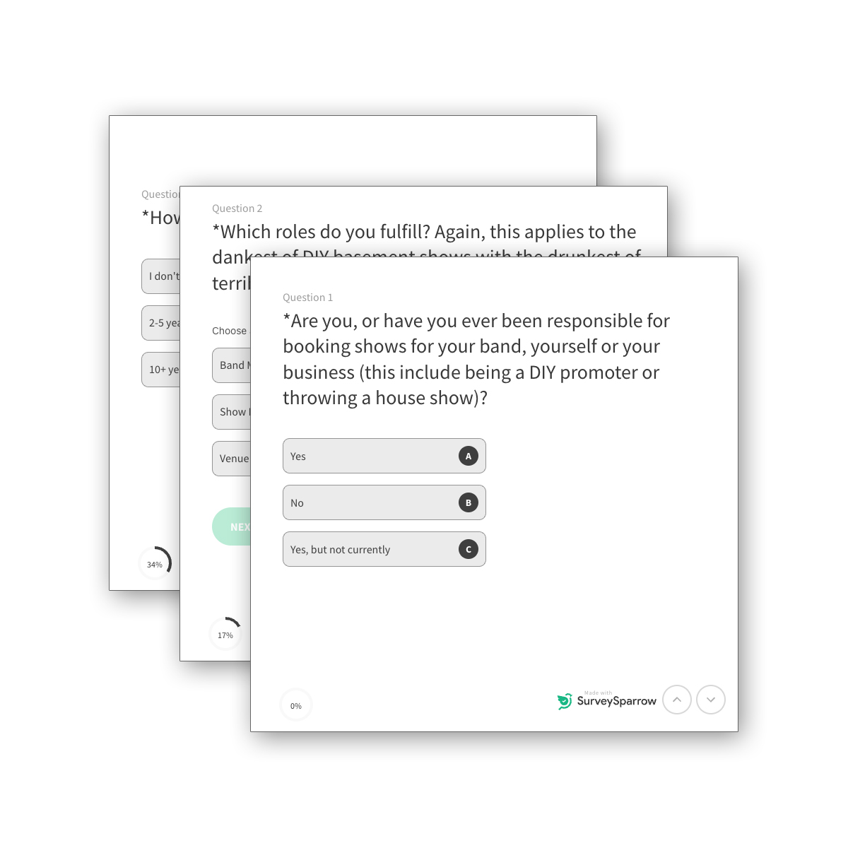
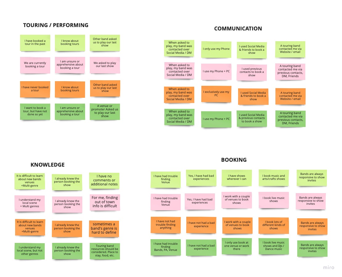
A pair of surveys were offered using Surveysparrow.com to gain knowledge about the users' communication and device habits, as well as what sort of obstacles they encounter. The results were fairly obvious but it quickly became apparent that the process of booking concerts really hasn't changed much in the last few decades. This lends credence to the concept of this application.
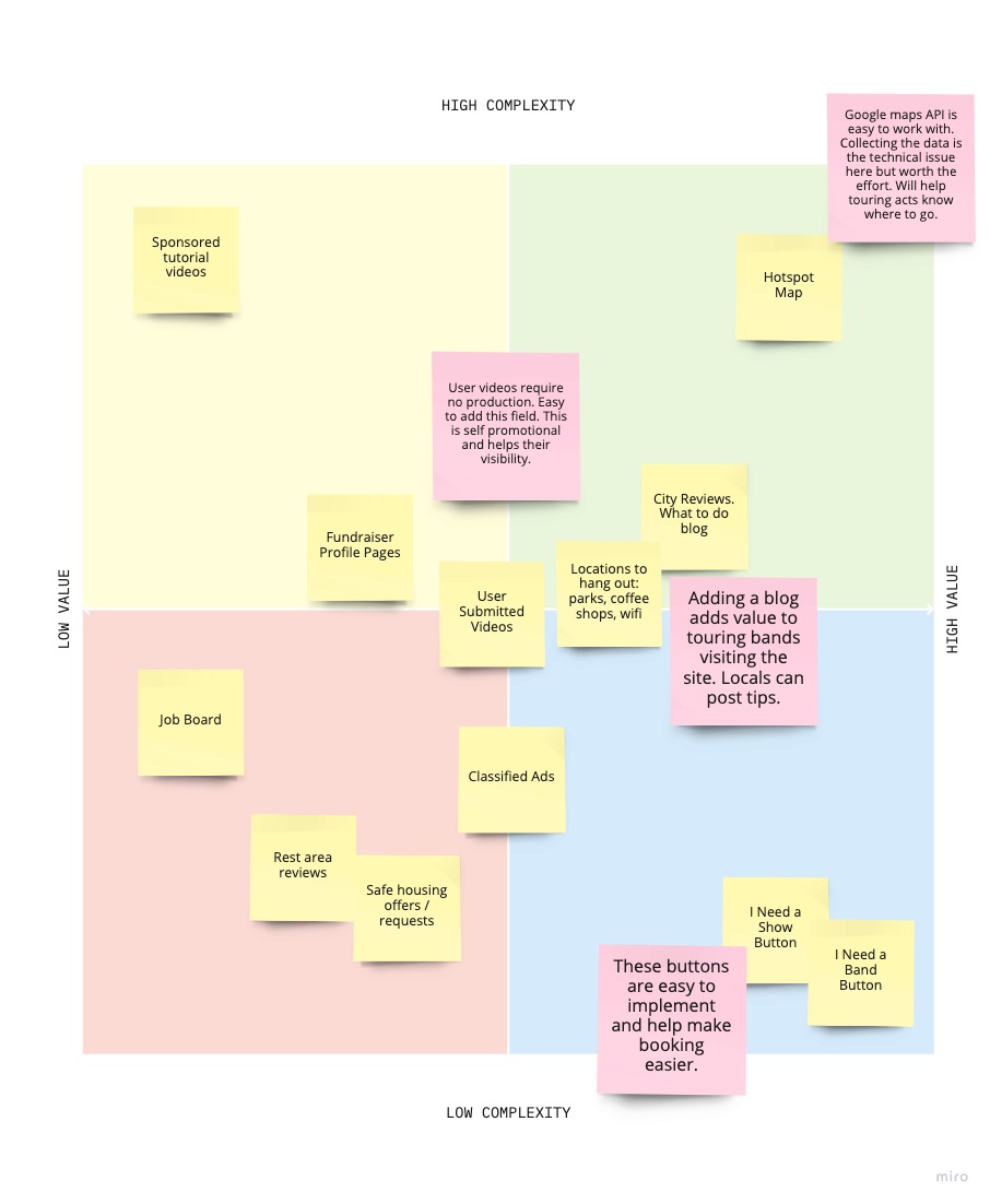
Results were synthesized using the tried and true method of sticky notes. Using Miro.com in this instance, to avoid wasting paper.

Design:
Concepts & Sketching
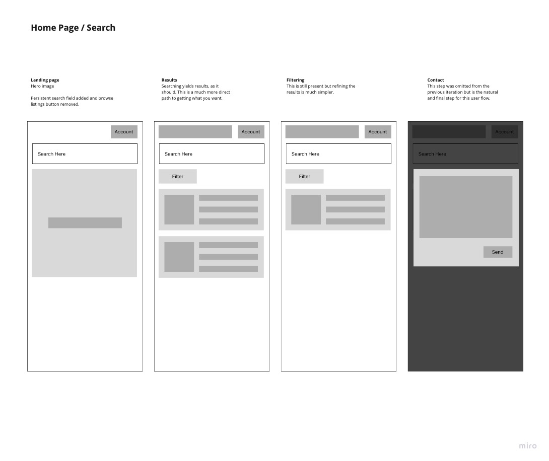
It made sense to design this application from a mobile-first perspective as more than 50% of the participants use their phones to plan their events. Because of this, all of the following screens imply use on a mobile device, however, final release will likely be a responsive web app.
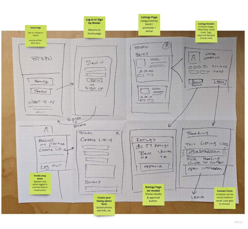
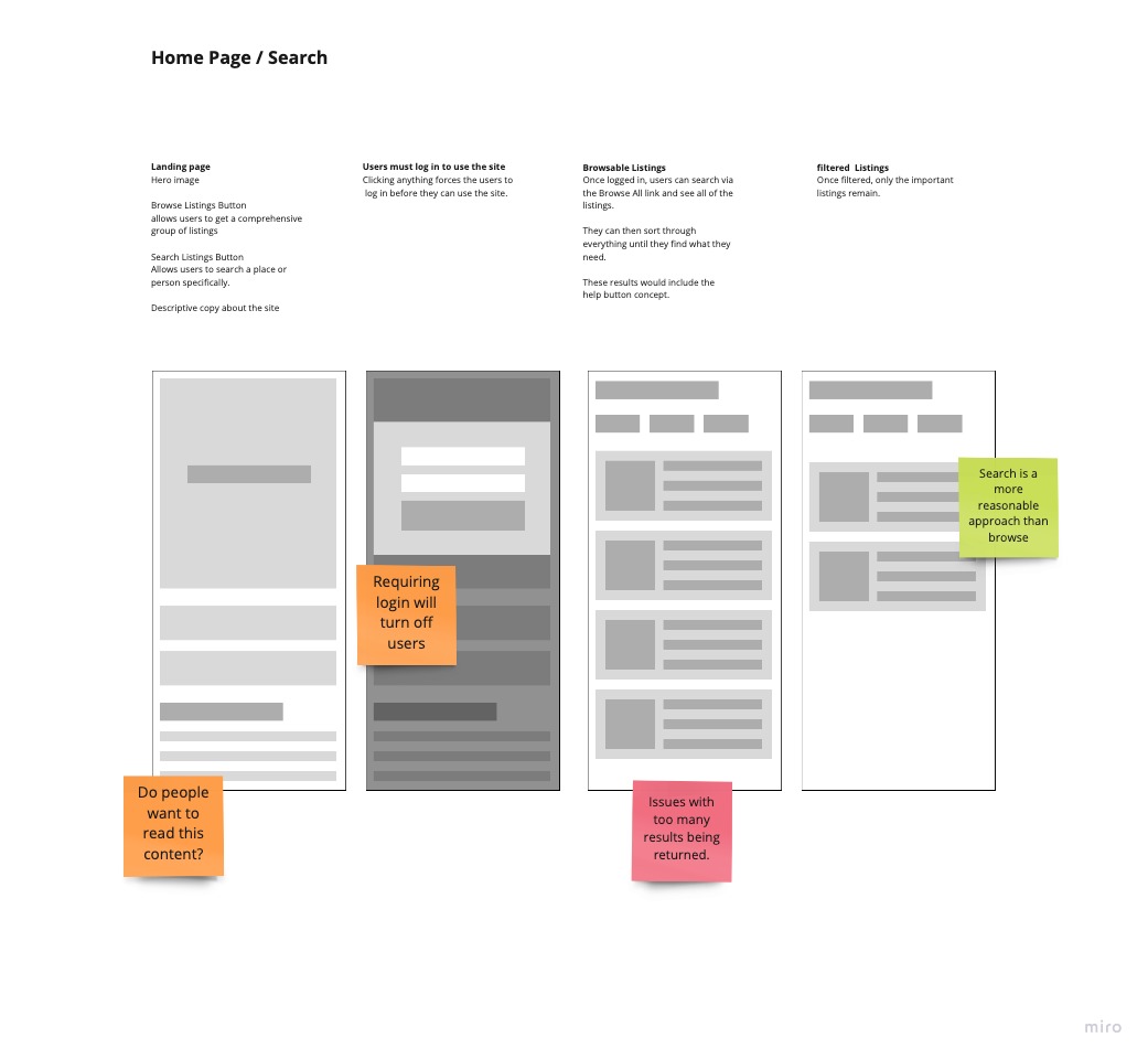
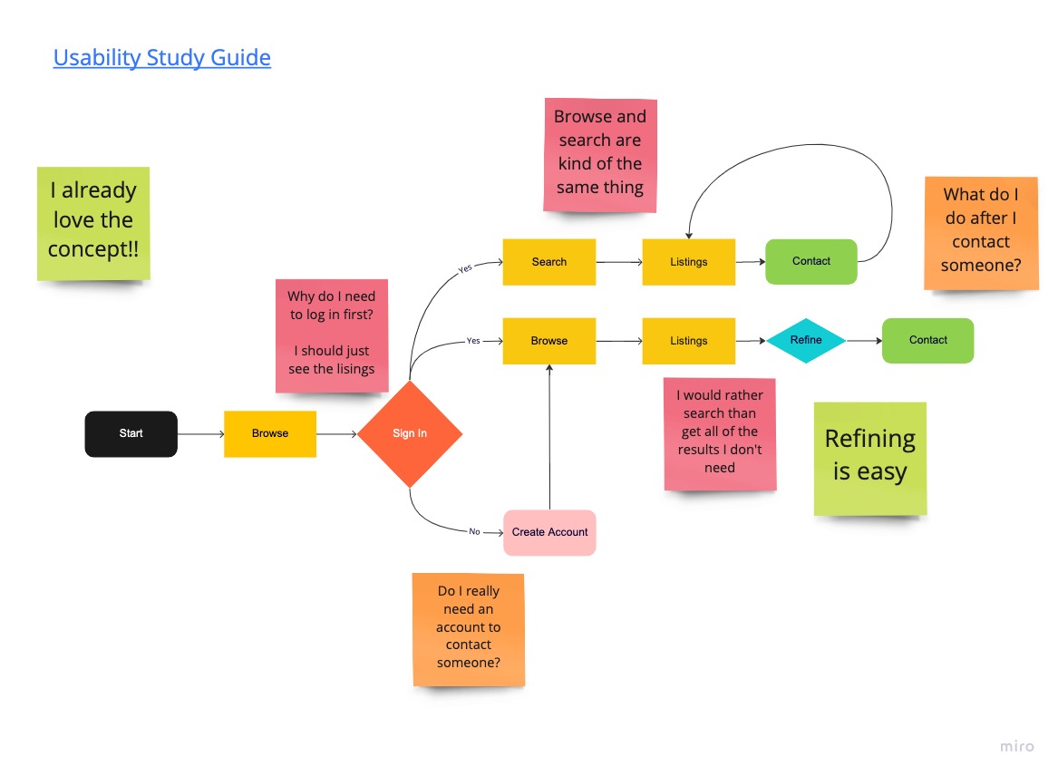
Beginning with low fidelity sketches, ideas and simple processes were planned in a way that made sense. This seemed to persist into mid-fidelity designs but changed a bit once the user flows and prototypes were built.
Several erroneous features were removed to supply the users with a simple process for searching and contacting venues.

Design:
Prototyping
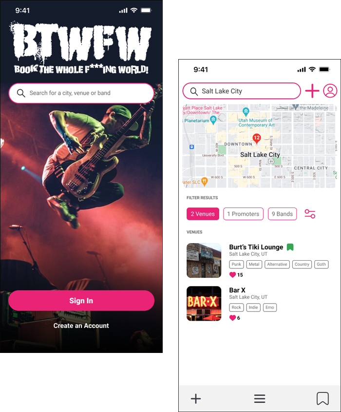
Using a combination of Adobe Photoshop and Figma, prototyping the initial design revealed a few concepts that required refinement. These included updating the accessibility standards and paying additional mind to the sorting feature.
Additionally, the communication process was brought into question and solutions that were reinforced by testing required at least one additional iteration.
Design:
Iteration & Review
Testing and revisions to the initial design payed off as the user flow was finalized and the design entered its final stage.
The realization that all users should have access to the data without the need of an account became the standard. This decision requires that only members have the ability to contribute. This makes the most sense and will help reduce the amount of moderation that is needed once the application is live.
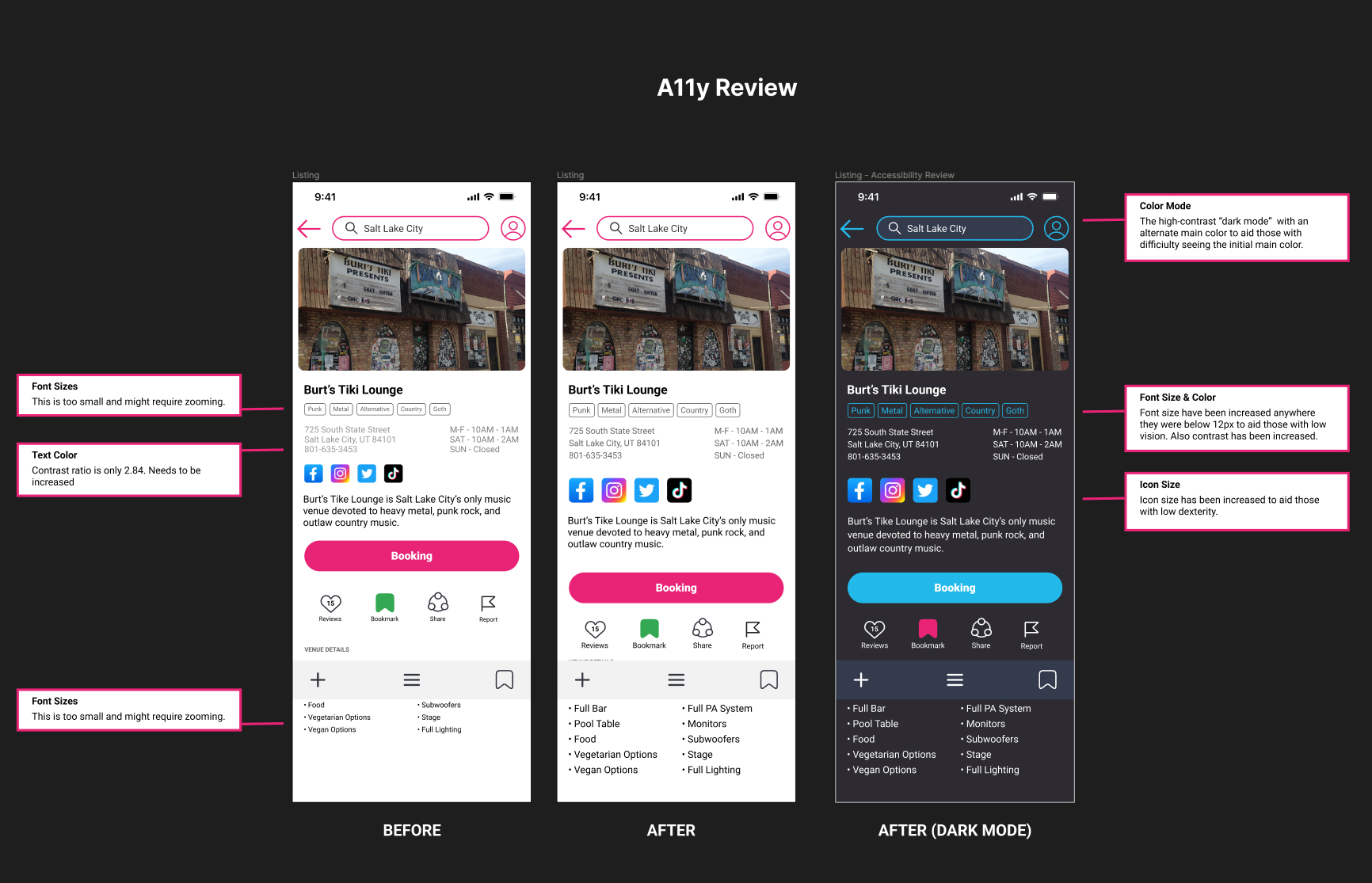
An additional iteration was performed which addressed accessibility needs, such as contrast, font size legibility, and clickable button size.
Solution & Impact Overview
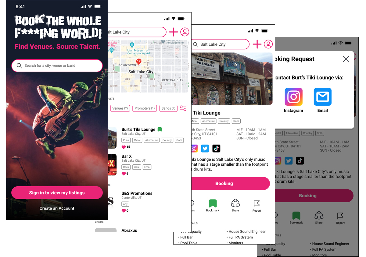
The final design takes into account the need for social media-based communication as well as a simplified user flow. User accounts are no longer required and accessibility standards have been implemented.
This revision will become the version one candidate for programming.
Final Thoughts
I think the plan for this app is solid, but have since begun building it asa phased approach. Currently in production is a band-centric version with venues and additional functionality to be added in the future. With the advent of consumer-friendly AI, I am no longer beholden to the requirements for developers. Creating this project as a web and mobile application is limited only be my time and attention.