Batten Disease Memorial
PROPOSAL
Create a modern visual display for the memorial that enshrines and maintains a living memory of those lost to Batten Disease. It is meant to be a persistent display at the BDSRA headquarters in Columbus, Ohio and will both help grieving loved ones come together and mourn as well as celebrate the lives that brought joy to their families, friends and communities.
ROLE
UX/UI Designer
User Experience Design, Visual Design, Front-End Development
Status:
On-Site, Active
Overview
The Batten Memorial, dedicated in 2004, exists to commemorate the lives of the children and adults that have been lost to Batten Disease. The current Memorial, containing 583 names (as the time of writing) has been displayed only at the annual family conference of the Batten Disease Support and Research Association (BDSRA).
Goals & Requirements
- Present names with respect and remembrance.
- Allow expansion for additional names and additional information.
- Simplify the handling, set up and take down.
- Reduce the annual cost to update and maintain.
- Transition management of the memorial to the national BDSRA office.
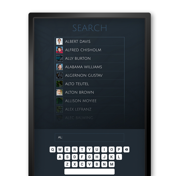
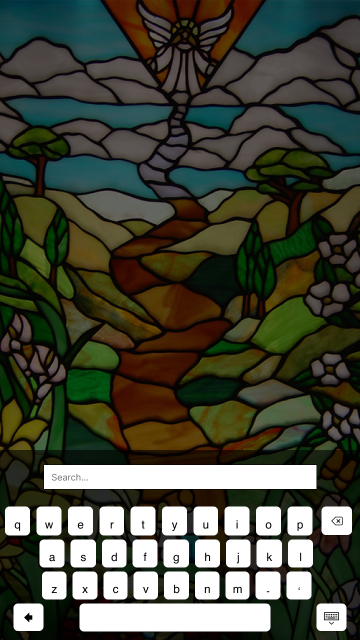
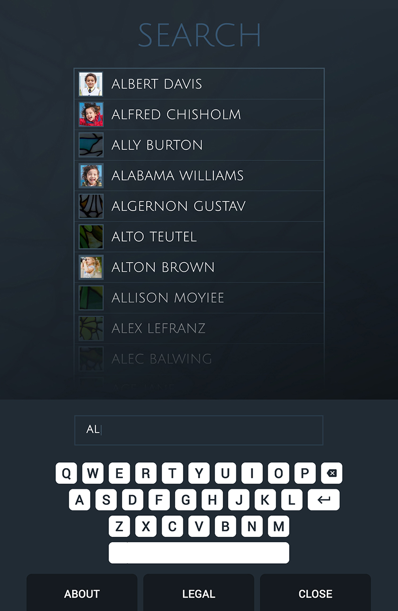
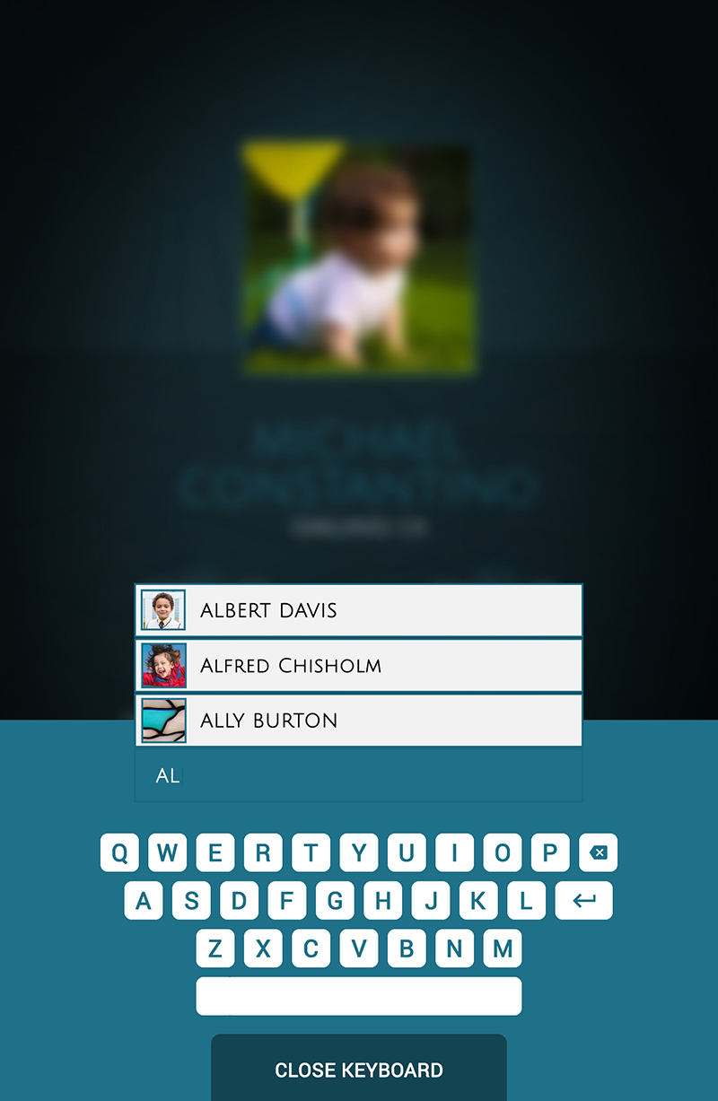
The primary group of individuals that will interface with the Memorial will be family members. This will typically occur by direct contact with the physical Memorial. A visitor will be able to approach one of the three touch screens and will be greeted with an image that is a scrolling list of all names with an appearance much like the current memorial. Using a called-up keypad the desired name can be typed in and retrieved.
Site Flows
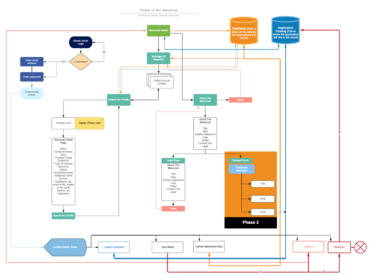
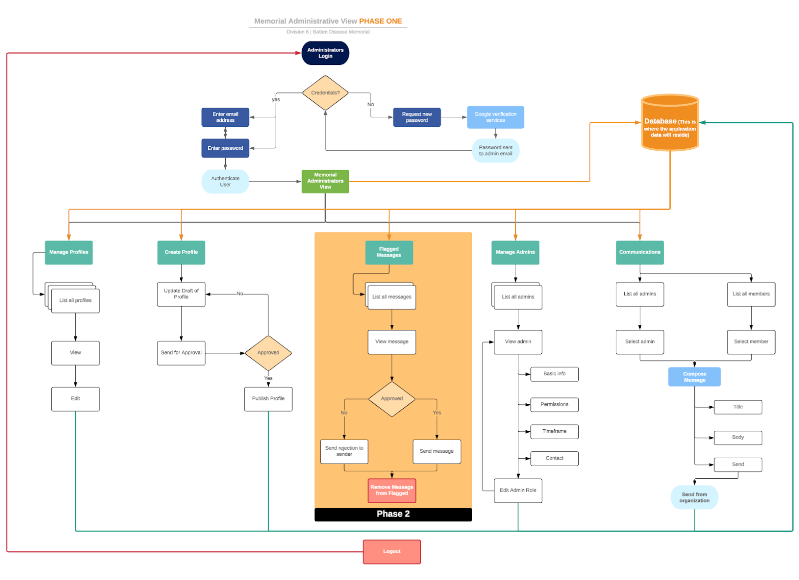
The user flow for both the front-facing user interface as well as the administration of data was constructed, based on the requirements above. A later phase "2" of the project was taken into consideration and noted in the design.
3D Visual Guide
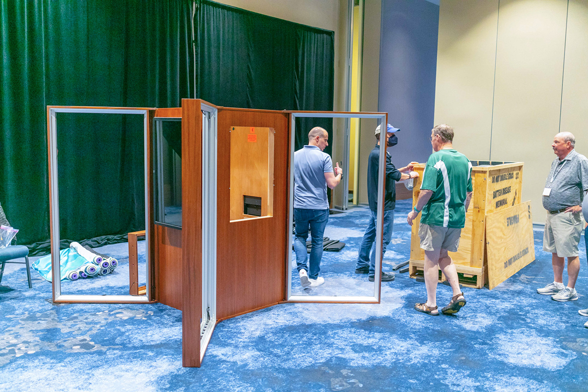
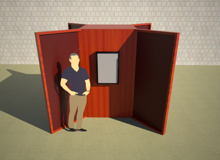
The concept of a physical space and interactive kiosk required some additional planning in terms of location and its environment. Specifications of the touch display and its enclosure were rendered in 3D space to get a feel for the overall experience.
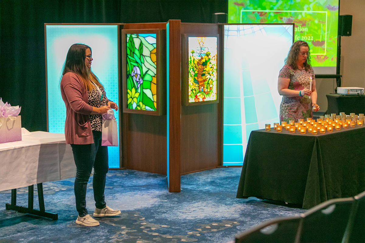
One of the factors that helped determine the visual style of the application was the large cherry wood panels that surrounded the display screen. This evoked the feeling of warmth and of the natural world.
Style Guide
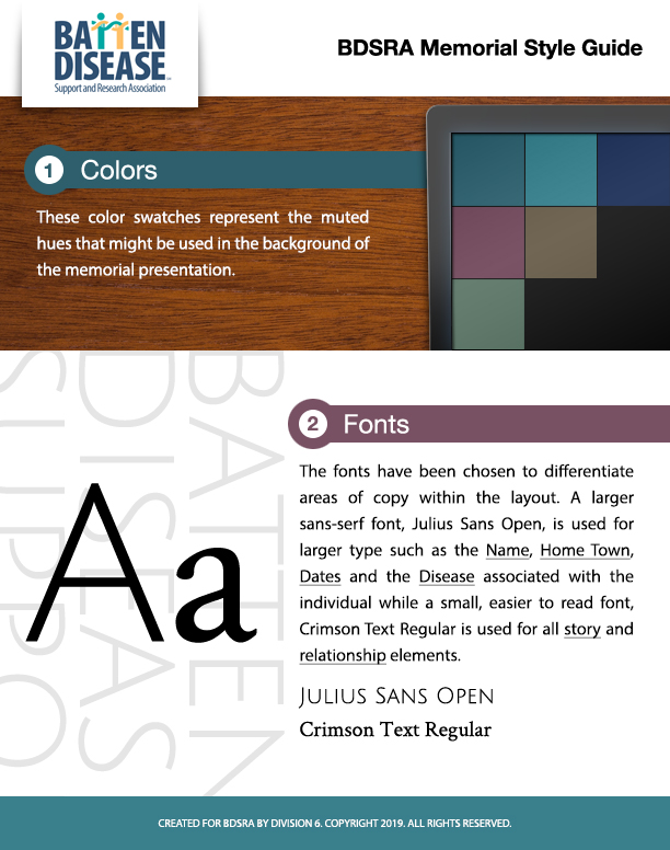
The brand identity and colors were chosen to convey both the somber sense of a memorial while still offering a connection to the natural world.
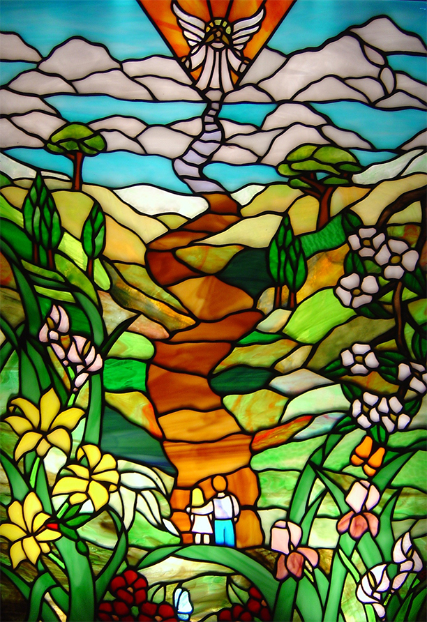
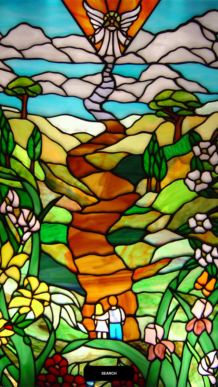
The stained glass window is the hallmark of the Batten organization and the stakeholders requested that it be included in the presentation somehow.

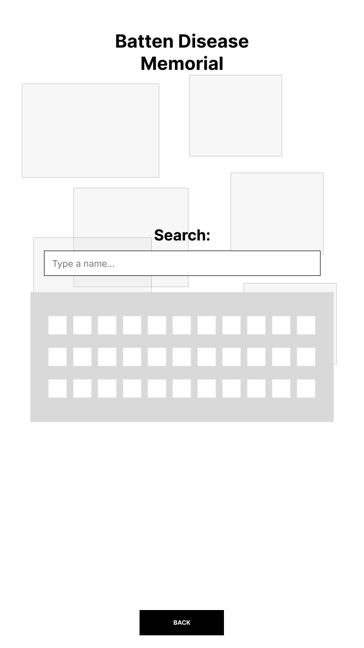
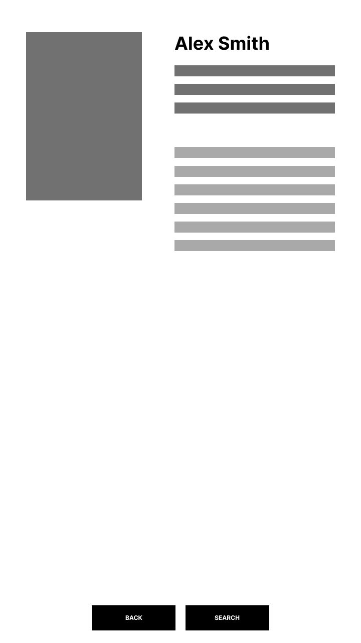
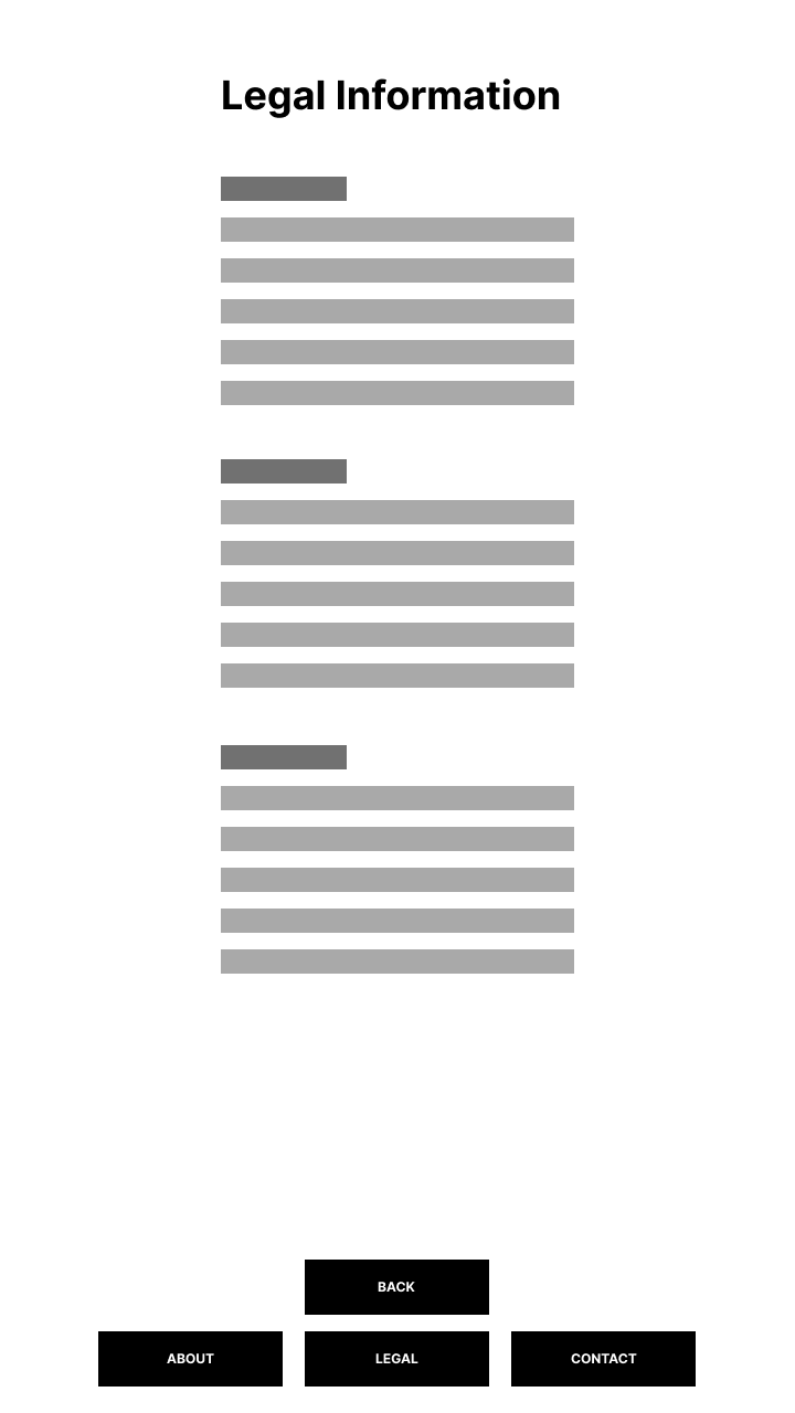
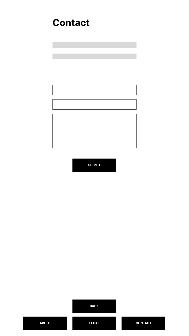
Lo Fidelity WireFrames
Based on the original flow chart, a lo-fi mockup was created that gave the stakeholders a view into how the flow of the screens would look. This raised some questions, concerns and new ideas that altered the concept slightly.


Mid-Fidelity Layouts
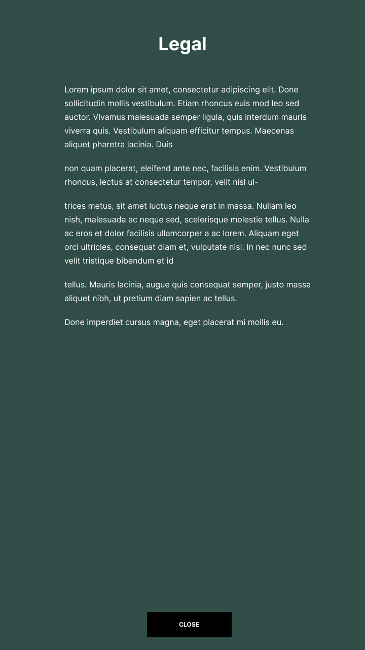
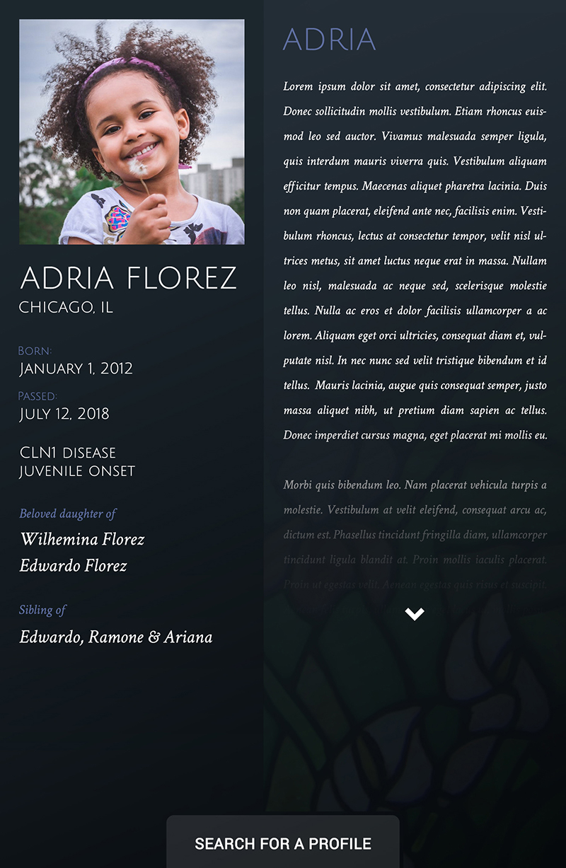
The 3D design and the initial feedback helped influence the first iteration. I also voiced my concerns about accessibility and use of the touchscreen display. Unfortunately, this disease is genetic and can affect multiple children into their late teens. This means that accommodating wheelchair bound individuals as well as the elderly visitors to the kiosk was key. Because of this, the controls were moved to the very bottom and the contrast and size of the buttons were increased.

High Fidelity Design
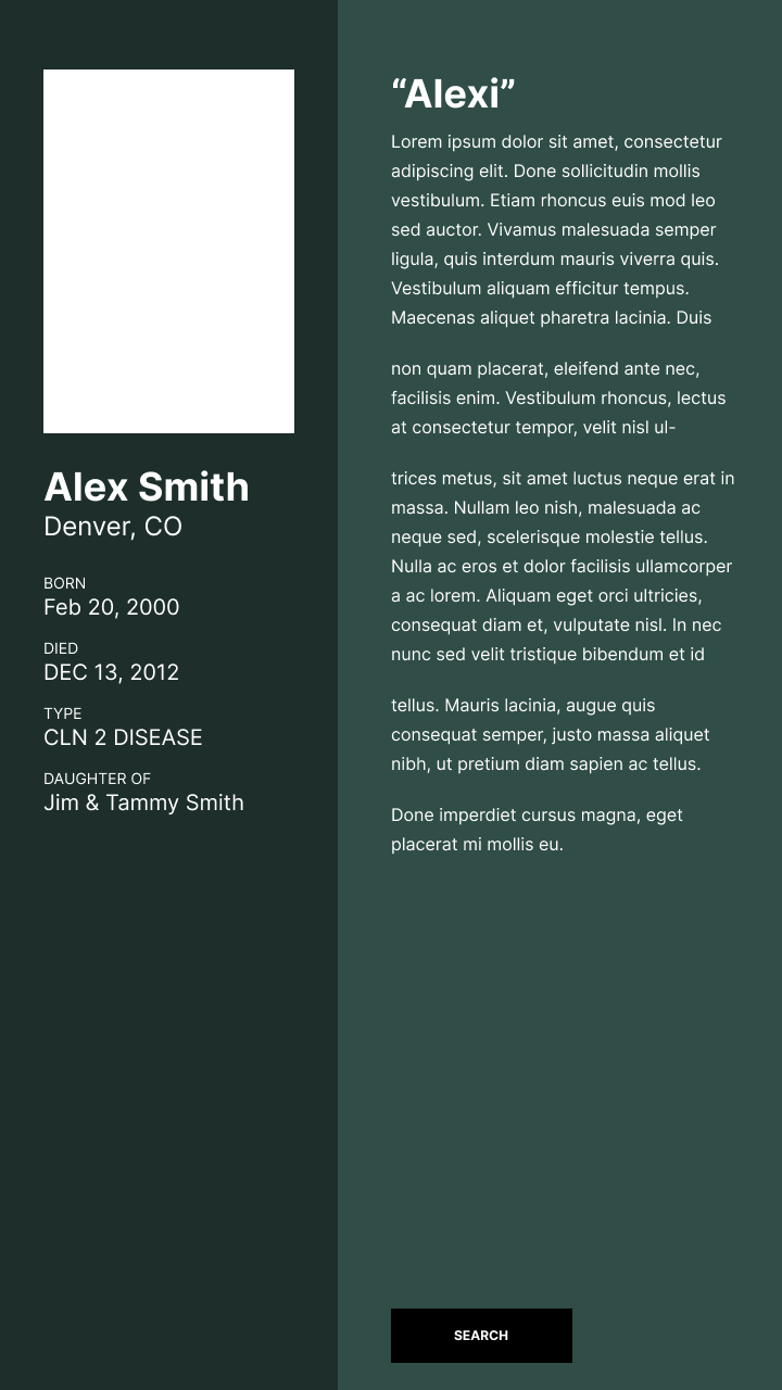
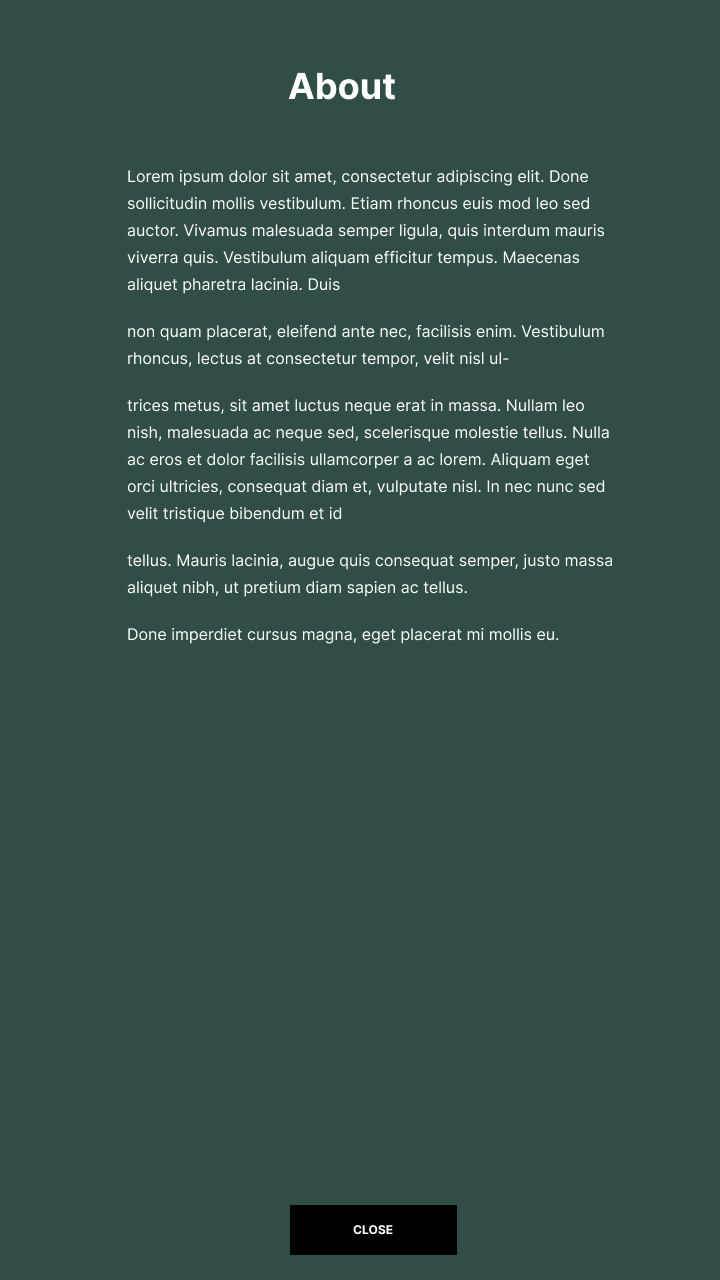
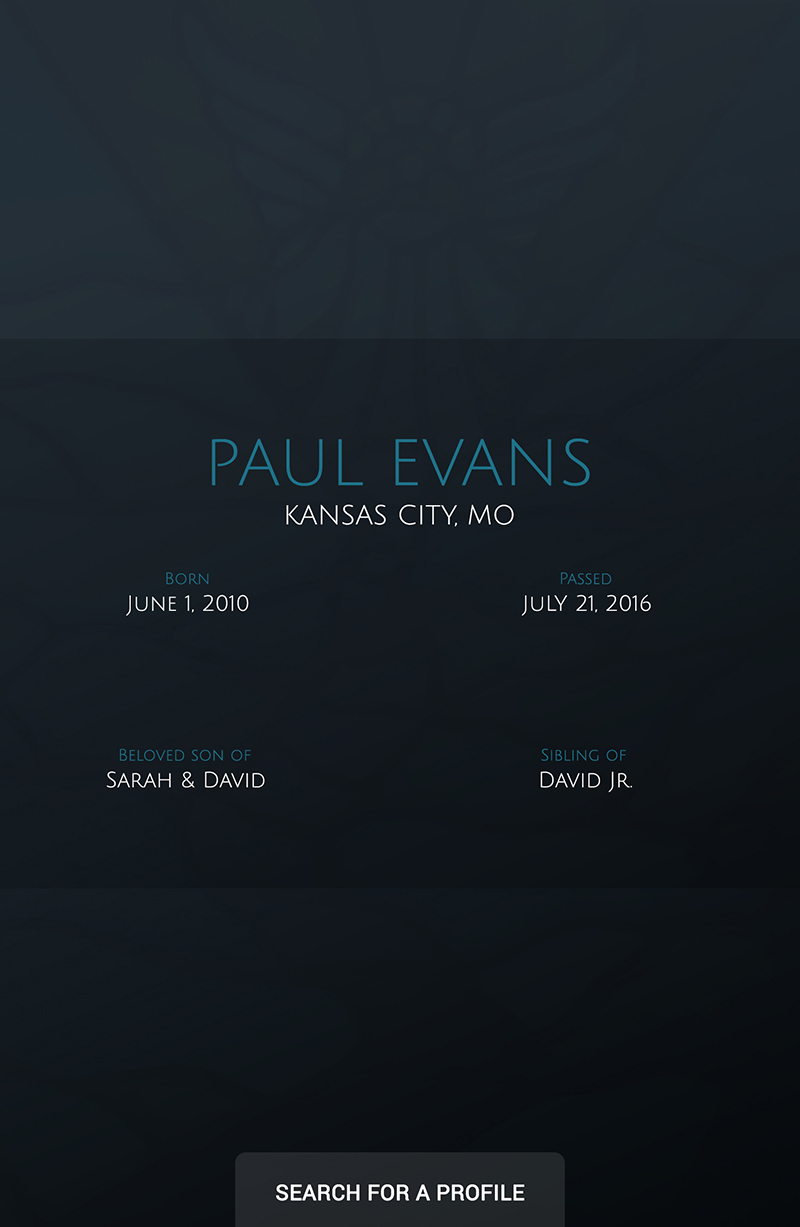
Additional views were added to support a few final requests from the stakeholders. The data fields were in our database, so a view to support browsing was an easy addition. Finally, a profile detail page for those who didn’t have a full complement of data per the request of the stakeholders because they realized that not all of their families had the ability to supply additional information.
I re-created the stained glass window as a vector graphic using Adobe Illustrator and was able to animate it using an SVG morphing script. It would be used as the screensaver resting state of the application. Once installed onto the server, there would be some real-world issues with this that were not foreseen.




Challenges
There were a fair amount of technical challenges with the touchscreen device and the machine acting as the server. The graphical processing power needed to animate the full-screen SVG animation was not available in such a small PC so a revised (simpler) animation was approved and added to the page prior to launch. Moving forward, any possible technical constraints that could affect an application should be addressed immediately. Core-functionality should be ensured while additions, such as large animations, can be tested and possibly added as a secondary deliverable.

Validation
To this day, the memorial continues to appear at the annual event as well as being a fixture at the BDSRA headquarters. I am happy to have been a part of this project that continues to help families that struggle with this terrible illness.
